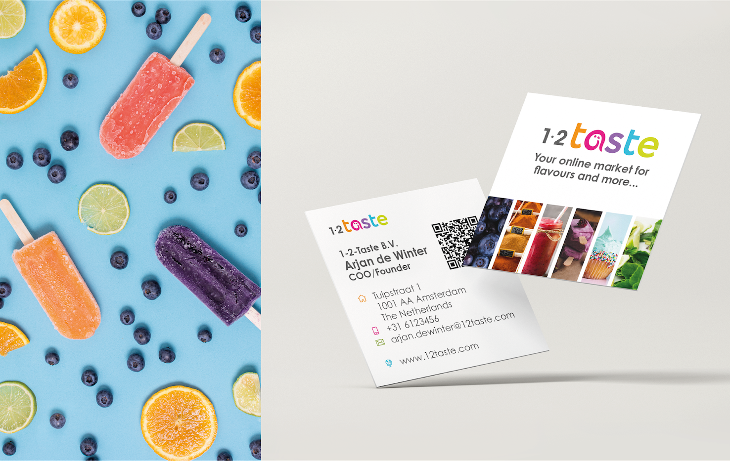
1-2-Taste is an online platform that sells flavors, fragrances and food specialty ingredients from different suppliers. They are the first to sell flavors online so are pioneers in the field. They started in India with their buyers being small and middle size companies like bakeries and ice cream sellers.They want a corporate identity that is ‘flavorful’ and bright, just a little bit different and yet professional.
“Mirjam has worked for 1-2-Taste from the beginning and the whole team is very happy with her work. She does all our branding, including logo design, business cards, icons and advertising on social media. She is professional with eye for details and comes up with surprising ideas.” JAN KLAWER 1-2-Taste
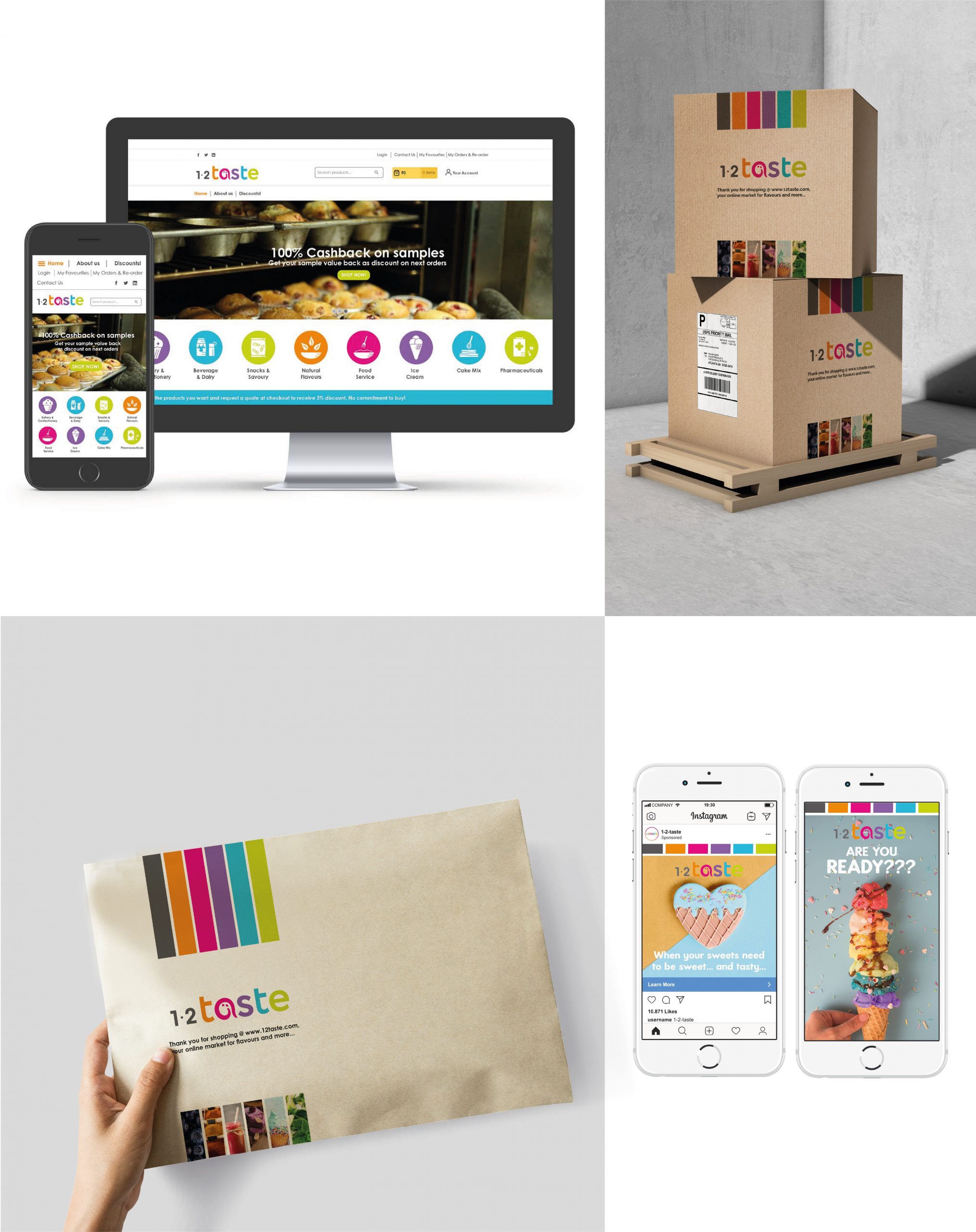
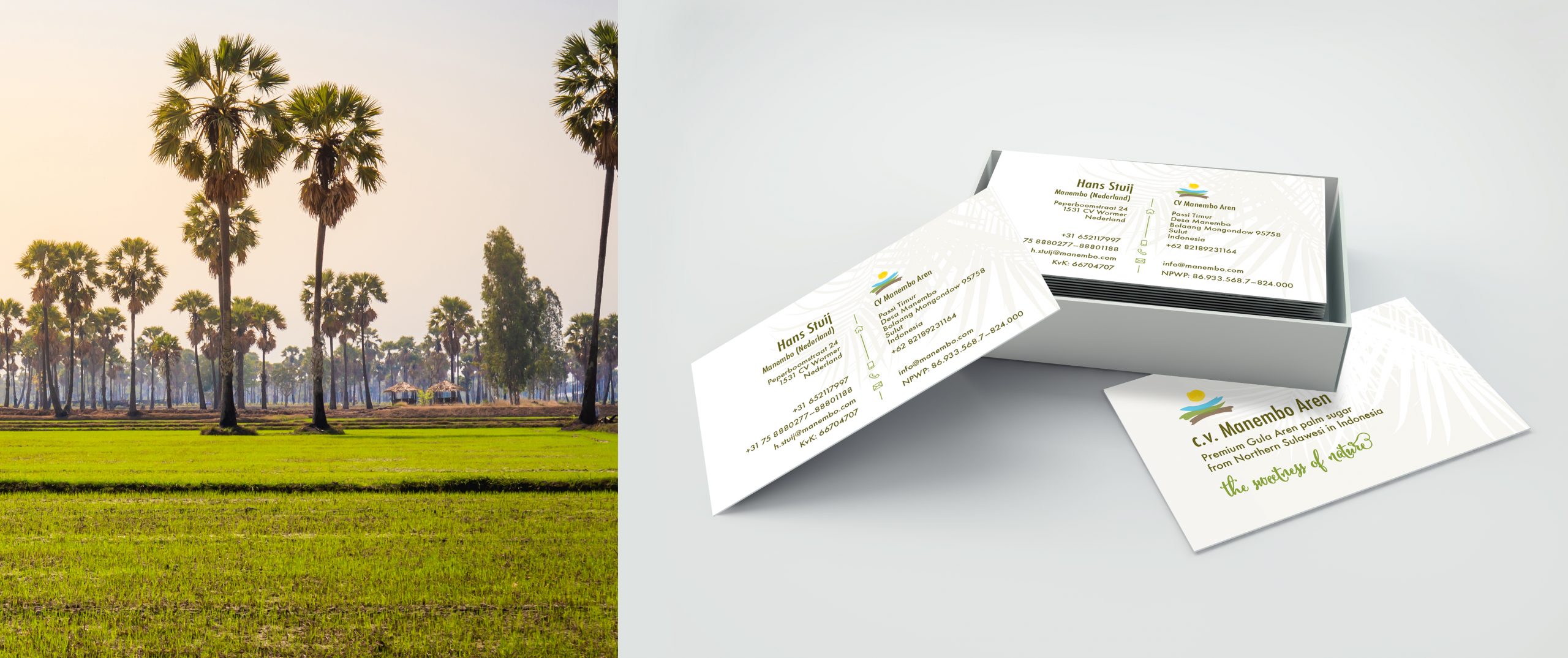
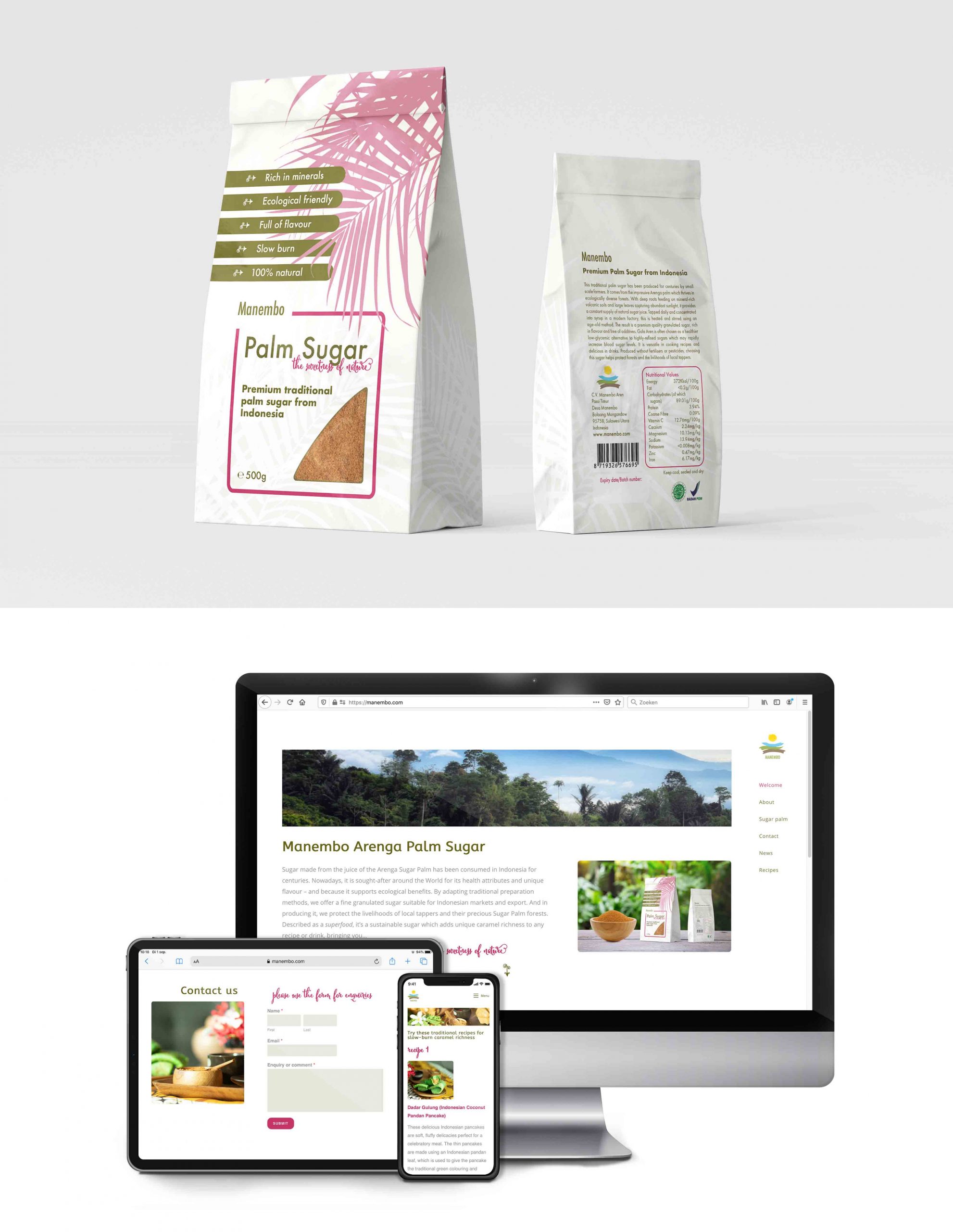
Manembo Aren is a premium traditional Arenga palm sugar produced by small scale farmers in Indonesia. It is a healthier low-glycemic alternative to highly-refined sugars. Produced without fertilisers or pesticides, choosing this sugar helps protect forests and the livelihoods of local tappers. The target audience is mostly female, well educated and conscious regarding health and the environment. They wanted packaging, a natural logo representing the sun, rain, tree and soil and a fully responsive website.
“I approached Mirjam to prepare some packaging artwork for a palm sugar product we were bringing to the market. The requirement was to reflect the natural, healthy and eco-friendly qualities of the product, whilst incorporating a range of factual information about the content within limited available space. Mirjam immediately understood the requirements and soon presented drafts which were captivating and professional. She was able to refine the drafts to provide the final deliverables in the specified software package without fuss, providing advice along the way on what looked best for the target market.” JEFF KERSEY Manembo Aren
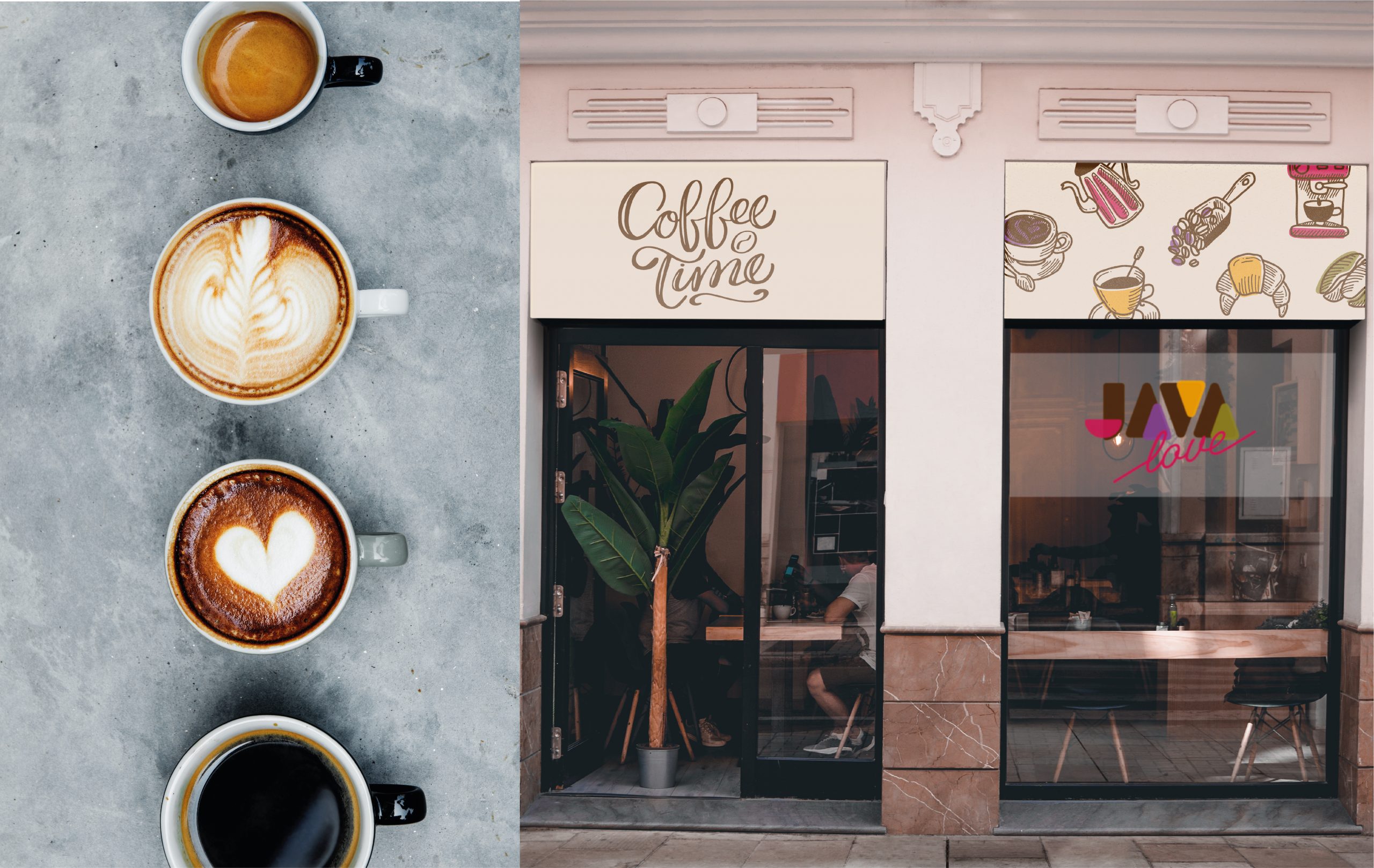
Java Love is the largest coffee company in Kenya that supplies only the best organic roasts from local growers. They needed a new logo with an organic and sustainable feel but not the “stereo typically green”. It needed to look edgy and attract a young, adventurous and hip audience that is living consciously and is not attracted to ‘mainstream’ like Starbucks

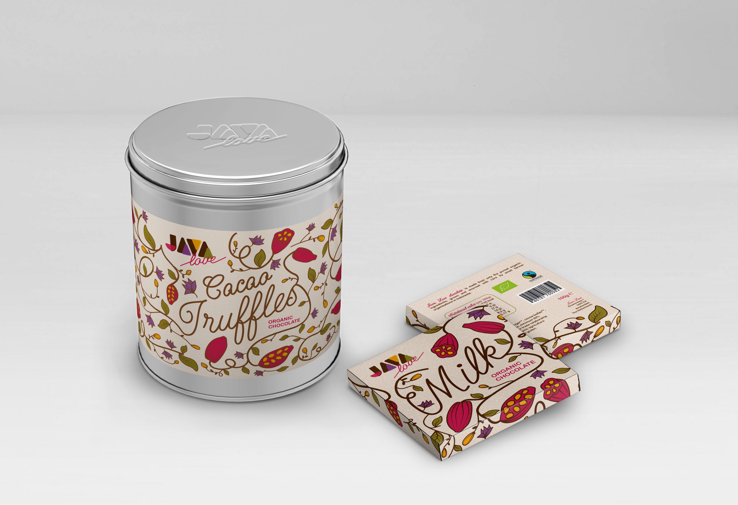
Java Love also needed packaging for their new chocolate brand. Like their coffee brand, the chocolate is organic and made with heart for nature and people. With a gift appearance, the chocolate should stand out on the supermarket shelves that have an abundance of chocolate bars as well as in their own coffee shop.
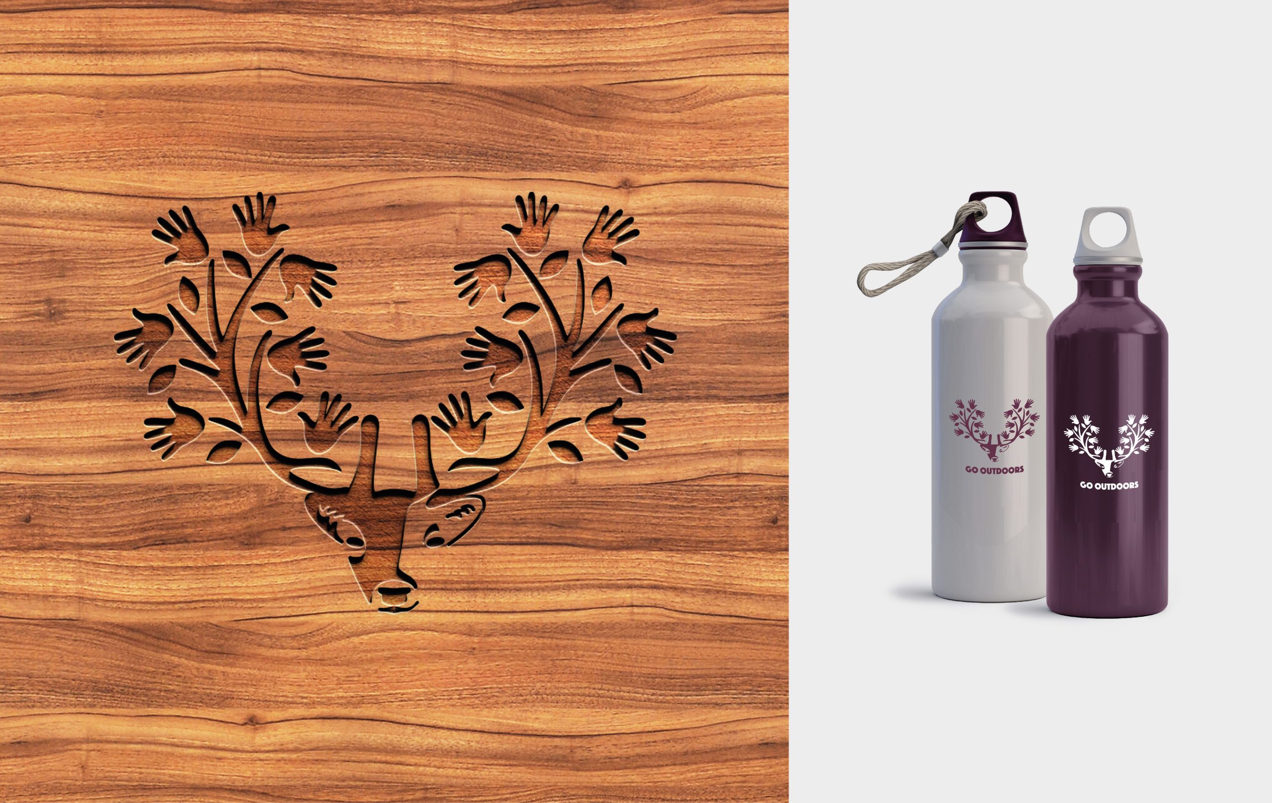
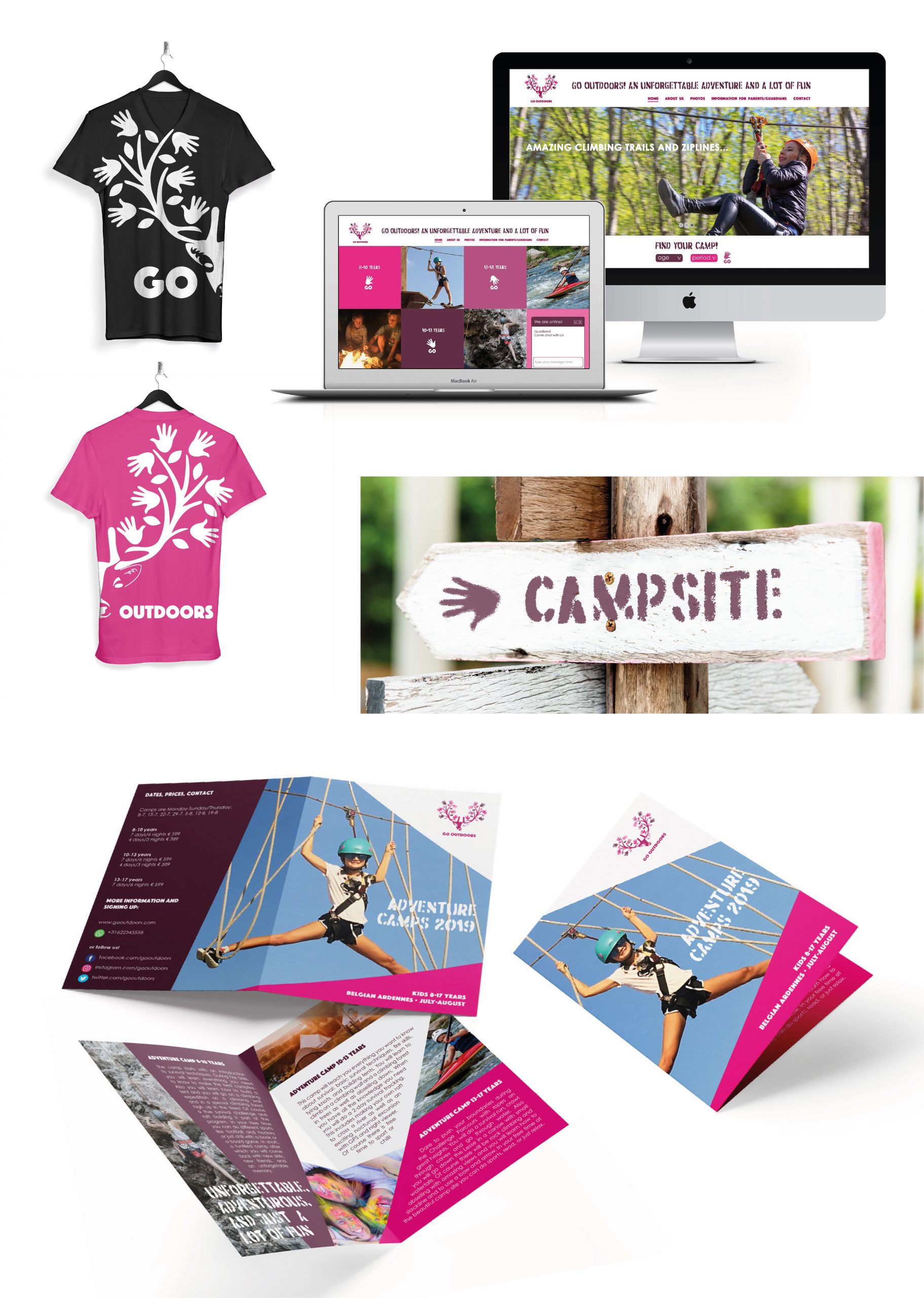
Go Outdoors is a company that organizes kids outdoor camps. The designs needed to show the outdoors, but not necessarily the typical green trees and tents. It should be attractive for the parents as well for the children itself from 8-17 years old, expressing fun, adventure, friends and activity.
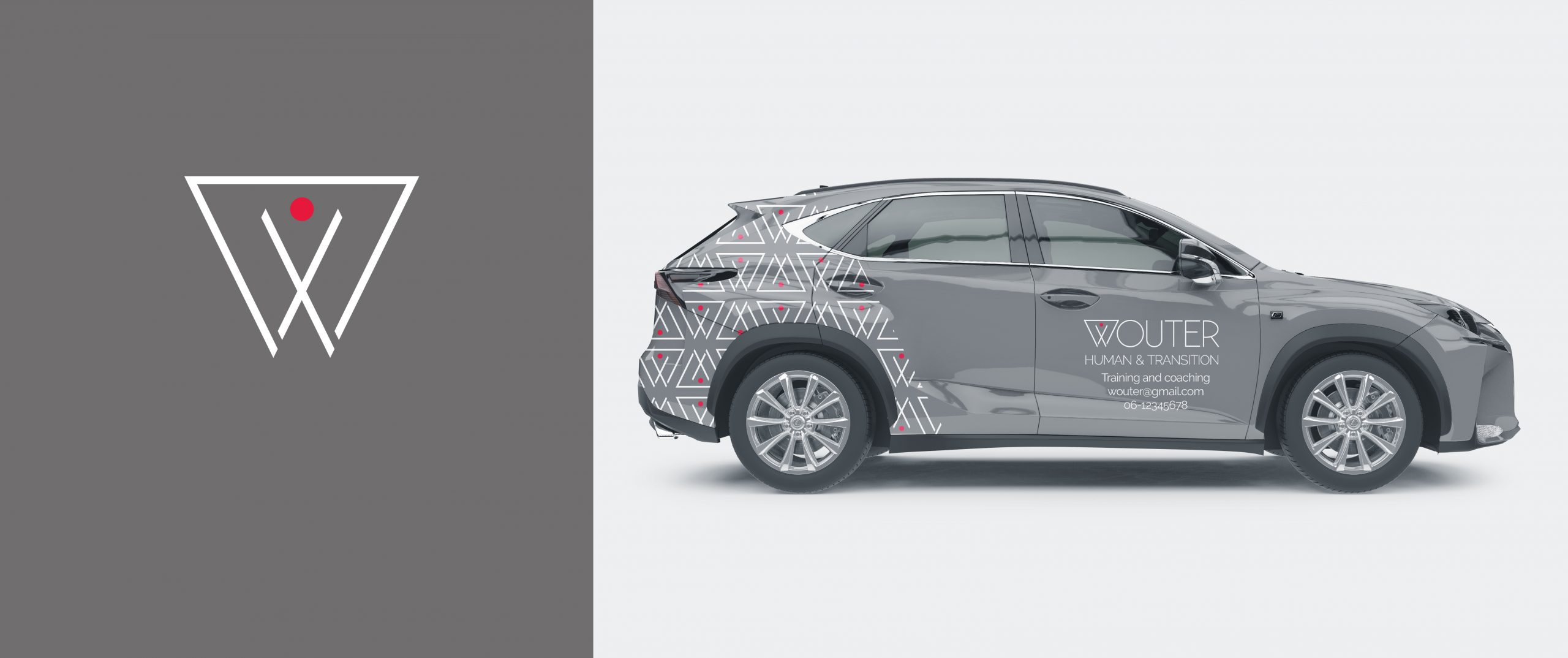
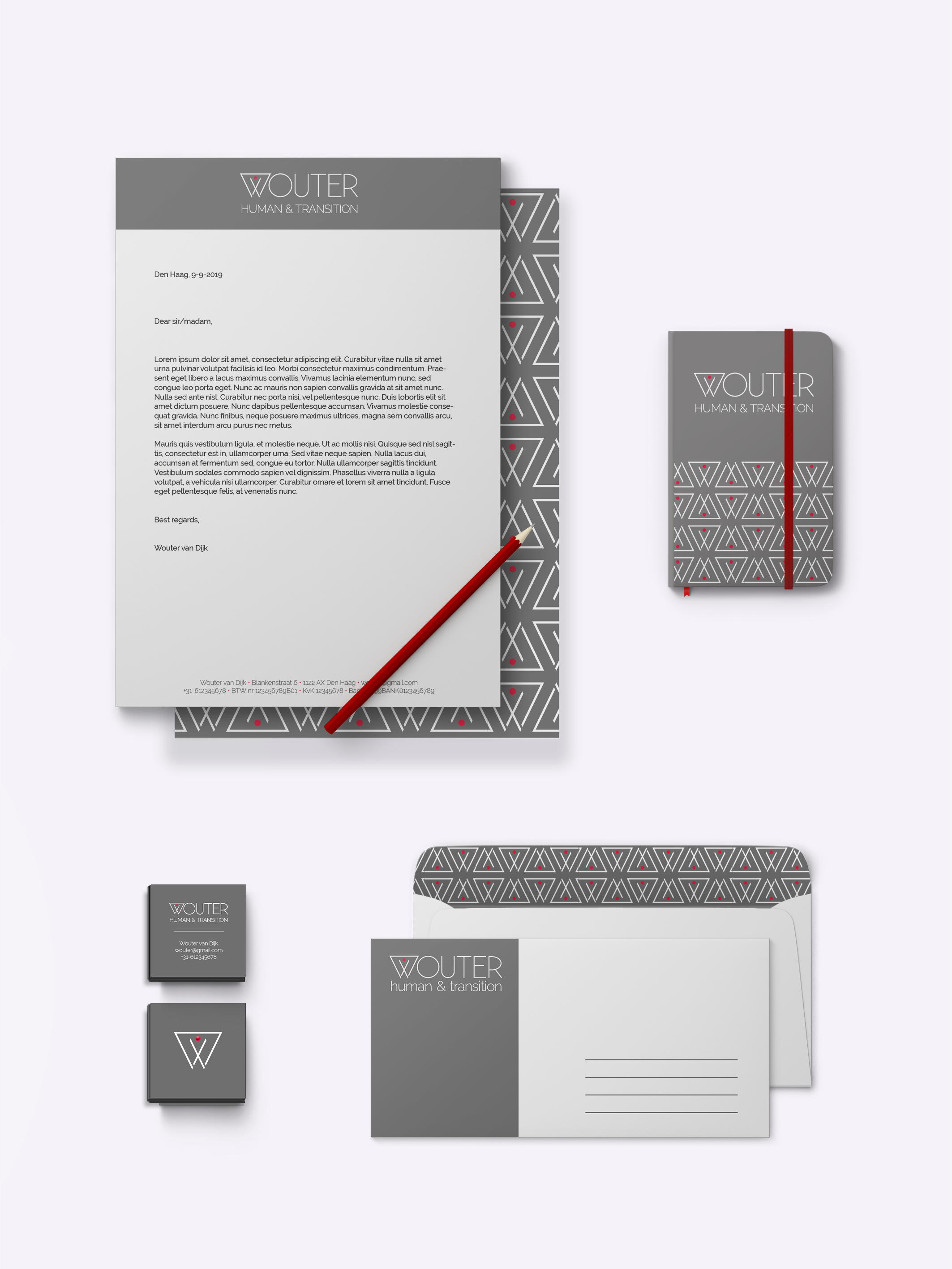
Wouter is a 40 year old man who recently started his own business. He provides coaching and training taking the person in a central position. His target market mostly consists of small to medium enterprizes. His corporate identity needs to appeal to highly educated professionals, both men and women, around mid-thirties and up. It should have a modern and professional feel with a positive message and show his focus on the person.
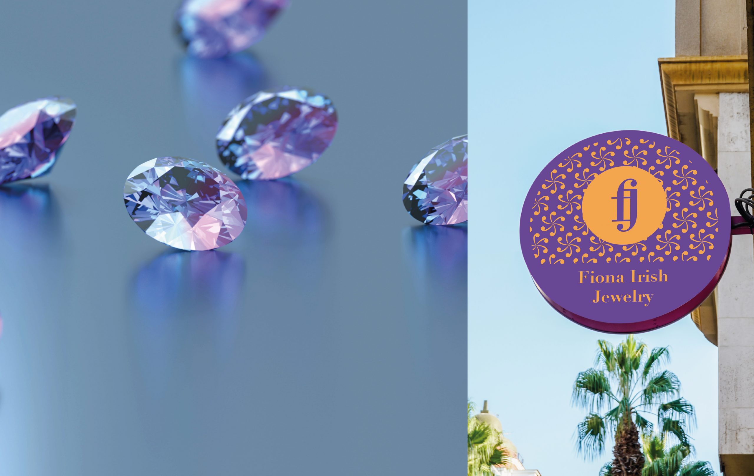
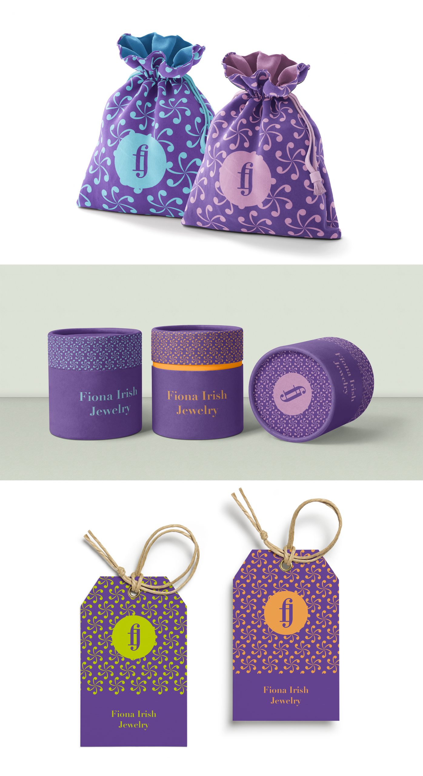
Fiona Irish Jewelry needed a logo design as well as designs of all the boxes and pouches for her brand. She wanted it to have a bright and happy style with a classic boutique touch. Her sales would be mostly to women from 16-40 years of age.